 Every so often, someone opens a product and says something like, “Wow, this is really easy to use.”
I always smile a little when I hear that. Because if the experience feels effortless, it usually means someone spent months wrestling with the opposite.
Design work is funny that way. When it’s done well, nobody notices the struggle behind it. They just glide through the interface and move on with their day. No friction. No confusion. No mental gymnastics.
But behind that calm surface? There were probably dozens of arguments about button hierarchy, navigation order, error states, and whether a step should exist at all.
That’s the part people don’t see. And it’s the part that experienced ux agencies spend most of their time dealing with.
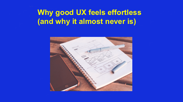
Most UX Problems Start Long Before the Interface
Teams often reach out for design help when something feels wrong in the product.
Onboarding numbers dropped. Support keeps getting the same confused messages from users. Sometimes it’s less measurable than that — the product just feels… heavier than it used to.
The instinct is usually to “improve the UI.” But when our team looks closer, the issue is rarely visual. It’s structural.
Over time, products accumulate decisions. A feature added here. A shortcut there. A workaround that quietly becomes permanent because nobody had the time (or energy) to rethink it properly.
Individually, those decisions make sense. Together, they start to create friction. UX work often begins by untangling that quiet complexity.
Good Design Is Mostly About What You Remove
One of the hardest conversations in product design happens when we ask a simple question:
“Do we actually need this step?”
You’d be surprised how often the room goes quiet. Every element in an interface exists for a reason — at least originally. But reasons age. What was necessary two years ago may now be redundant, or even harmful.
Users feel this accumulation immediately. They don’t articulate it in product feedback. They simply slow down. Click around. Try again.
The best ui ux design services don’t rush to polish screens. They start by figuring out which parts of the system are still doing real work and which ones are just… leftovers.
Removing complexity is rarely dramatic. It’s more like cleaning a garage after years of gradual clutter. And yes, sometimes people get attached to things.
Context Changes Everything
One pattern we’ve seen repeatedly: teams borrow design patterns from other products without really questioning whether they belong.
A dashboard layout that works beautifully for a financial analytics tool might feel awkward in a logistics platform. A navigation pattern popular in consumer apps might frustrate enterprise users who work inside the product all day.
Context matters. More than trends.
That’s one reason many companies end up working with experienced nyc product design firms. Designers who’ve seen dozens of products evolve start recognizing subtle signals. The moment when a pattern feels forced. The moment when something “clever” might actually increase cognitive load.
It’s not about copying what works elsewhere. It’s about understanding why it worked.
Real UX Shows Up in Tiny Moments
Here’s something interesting: the biggest improvements in user experience rarely come from big visual changes.
They show up in tiny moments. A clearer confirmation message. A button placed where your hand expects it to be. A form that remembers what you typed instead of forcing you to start over.
Small things. But users notice them. Maybe not consciously, but emotionally. The product feels considerate. Predictable. Calm.
We once redesigned a workflow where the only visible change was removing two unnecessary fields from a form.
Support tickets dropped by almost half. Two fields.
Designers Don’t Work Alone (Even If It Sometimes Looks That Way)
There’s a stereotype that designers sit quietly in front of Figma, moving rectangles around.
Reality is messier. Good UX work involves constant conversations with product managers, engineers, support teams, and sometimes even sales. Everyone sees a different side of the product.
Engineers know which interactions will break under load. Support knows where users panic. Product teams understand the roadmap pressure behind every feature.
When those perspectives come together early enough, the interface becomes a shared language rather than a visual artifact handed off at the end.
And the product gets better. Slowly. Then suddenly.
The Quiet Payoff
The strange thing about UX work is that success often feels anticlimactic.
There’s no fireworks moment when a design “wins.” Instead, the product becomes calmer. Users stop hesitating. Internal debates about tiny interface decisions fade because patterns start making sense.
It’s subtle. But if you’ve ever used a product where everything feels exactly where it should be… you know the feeling.
Someone spent a long time thinking about that. Probably arguing about it too. And honestly? That’s the part I like most about this work.